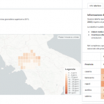
On the occasion of International Earth Day, a new service becomes available on Dataclime that allows users to monitor and visualize the evolution of temperature anomalies across Italian territory through Climate Jellyfish, dynamic representations inspired by NASA’s Scientific Visualization Studio.
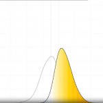
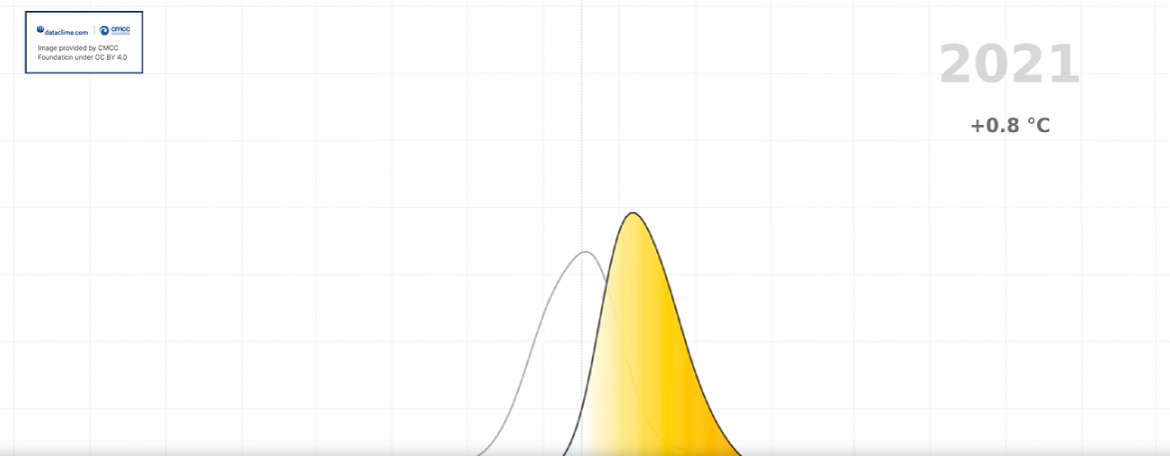
The Jellyfish display the evolution of anomalies over time relative to the 1991–2020 reference climatological period, using an intuitive color scheme: blue tones for below-average temperatures, orange and red for above-average ones. An evolution of the Climate Stripes already available on Dataclime, the Jellyfish add a dynamic dimension to the visualization, making it easy to quickly identify warming trends and signals of climate variability.
The first Jellyfish analyzes land surface temperature (LST) using high-resolution satellite data acquired from MODIS and LANDSAT satellites. LST represents the radiative temperature of the Earth’s surface, distinct from air temperature, and is influenced by factors such as land cover, soil moisture, vegetation, and urbanization. Anomalies are calculated by comparing daily acquisitions against a reference climatology, in order to highlight deviations from expected conditions and analyze possible warming trends, with applications in environmental analysis, spatial planning, and the study of urban heat islands.
The second Jellyfish visualizes air temperature anomalies based on the very high-resolution climate reanalysis datasets VHR-REA_IT from CMCC (1981–2024) and FAIR by Dataclime (2025).
Both visualizations are interactive and explorable at the provincial scale, offering a targeted reading of climate signals across the territory in support of various activities such as awareness-raising, local planning, and the development of climate change adaptation policies.